Designing for User Experience: Key Considerations
Date
Jul 2024
Category
UX/UI

IRCTC is one of the most essential digital platforms in India. Millions of people depend on it every day for something that is often urgent and emotionally loaded—travel. Whether it’s visiting family, catching a last-minute train, or planning a long journey, users usually arrive with a clear goal and very little patience.
That makes clarity, speed, and predictability non-negotiable.
This article looks at the IRCTC website through real user interaction, highlighting where the experience creates friction—and how small design decisions add up to a stressful journey.
First Impressions: Too Much at Once
The moment the IRCTC homepage loads, users are met with a dense interface filled with links, banners, secondary actions, and promotional content. Important actions like login, registration, and ticket booking compete visually with unrelated information.
Instead of guiding users forward, the interface asks them to pause and search.
When a platform serves millions of users with time-sensitive needs, every extra second spent scanning the page feels expensive.
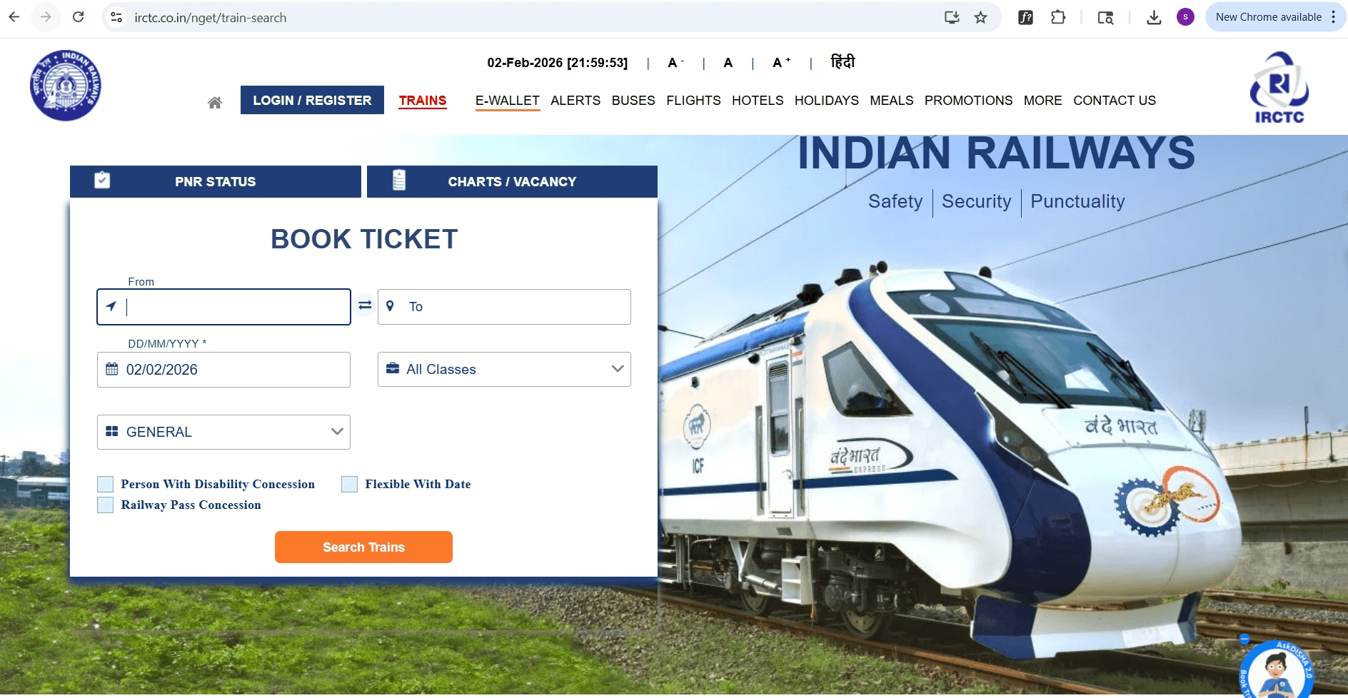
What this creates:
Cognitive overload on first glance
Difficulty identifying primary actions
A sense of urgency turning into frustration
Navigation That Slows Users Down
The top navigation includes many items that don’t directly support the core task of booking or managing tickets. For first-time users, it’s not immediately clear where to start.
Users must decide:
Which link actually matters right now?
What can be ignored safely?
Where does login fit into this flow?
This decision-making shouldn’t be necessary. Navigation should remove questions—not create them.
Login and Registration Interrupt the Flow
Instead of feeling like a natural step, login appears as a disruptive popup layered over the page. The form itself lacks clear guidance when things go wrong.
Examples users encounter:
Buttons remain active even when required fields are empty
Errors appear late or feel generic
Multiple login paths (user, agent, alternative flows) add confusion
At this point, users aren’t struggling because of complexity—they’re struggling because the system isn’t communicating clearly.
✅ Suggestion: Instead of a popup, keep the login screen inline within the same page for better continuity.

Forms Feel Heavy and Unforgiving
Several form interactions feel rigid and outdated. Input fields are large, spacing is inconsistent, and error messages often lack clarity.
Messages like “Unable to perform transaction” don’t help users recover. They only confirm that something failed—without explaining why or what to do next.
When users don’t know how to fix an error, confidence drops quickly.
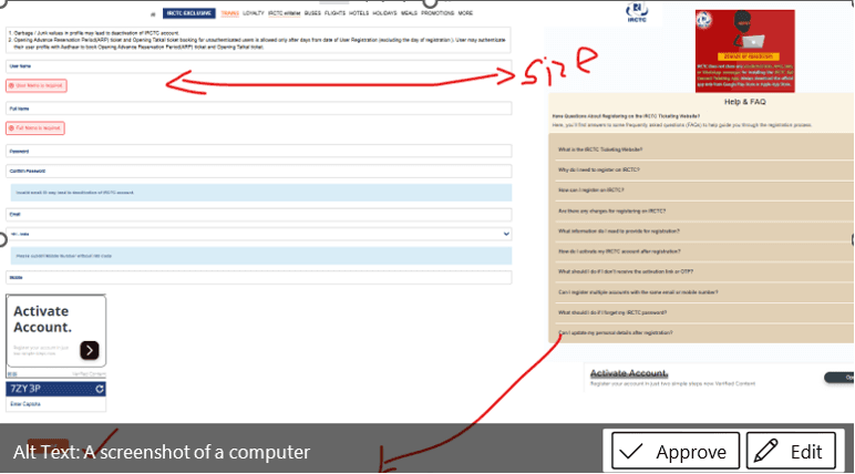
✅ Suggestion: Center-align the form and disable the button until valid input is detected. Provide inline validation prompts for better UX.
Inconsistent Buttons and Visual Signals
Across different pages, buttons change size, style, and visual importance. Actions like Search, Sign up, Show More, and Proceed don’t follow a consistent pattern.
This forces users to visually re-learn the interface on every screen.
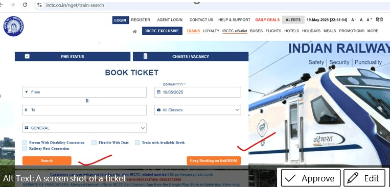
✅ Suggestion: Maintain consistent button dimensions across all modules.
Small Interruptions That Add Up
On their own, none of these issues completely block task completion. But together, they create a sense of resistance.
Users:
Hesitate before clicking
Double-check actions
Feel unsure whether the system understood them
Over time, this erodes trust—even though the platform itself is critical and widely used.
For many users, IRCTC is used during moments that already carry stress — late-night bookings, last-minute travel, family emergencies, or festival rush. In these situations, even minor uncertainty feels amplified. When the interface hesitates, users hesitate too.
What Works Despite the Friction
It’s important to note that IRCTC does succeed in one major way: it functions at massive scale. Core booking flows exist, and users eventually reach their goal.
But “eventually” shouldn’t be the benchmark.
With clearer navigation priorities, consistent interaction patterns, and more empathetic feedback, the experience could feel far more supportive—especially during moments when users need speed and certainty.
Final Thoughts
IRCTC is not just another website. It’s infrastructure. And infrastructure UX has a responsibility to reduce stress, not add to it.
The platform doesn’t need a complete redesign. What it needs is restraint, consistency, and clearer communication—so users can focus on their journey, not the interface.
Good UX doesn’t ask users to adapt.
It adapts to users—especially when it matters most.