The Role of Prototyping in Product Design
Date
Jul 2024
Category
Product Design

Designing for education platforms carries a unique responsibility. Parents aren’t simply browsing—they’re making emotionally significant decisions about their children’s care, safety, and future. In this context, clarity, predictability, and trust matter just as much as visual polish.
This article examines the KinderCare Learning Companies website through the lens of real user behavior, highlighting where the experience succeeds—and where small interaction gaps introduce unnecessary friction.
Website reviewed: https://www.kc-learning.com/
First Impressions: Trust Is Established Quickly
At first glance, the KinderCare website feels professional, warm, and credible. The visual design communicates reliability—an essential requirement for education and childcare brands.
This strong first impression works in the site’s favor. Users are more willing to explore, assume competence, and continue their journey when an interface feels thoughtfully designed.
However, visual trust alone isn’t sufficient. As users begin interacting with the site, moments of uncertainty emerge—not because the design looks wrong, but because the behavior isn’t always clear.
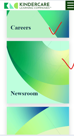
Where Clarity breaks down
Several homepage sections (Mission, Careers, Newsroom) rely on large image tiles with text overlays. While visually engaging, these elements don’t clearly communicate what will happen when users interact with them.
Users are left wondering:
Is the entire card clickable?
Will this open a new page or expand content?
What action am I committing to?
This hesitation highlights a gap between “looks polished” and “feels predictable.”
What could improve this:
Clear call-to-action labels such as “Explore Careers” or “Learn More”
Subtle interaction cues like hover states, arrows, or image darkening
Consistent click behavior across all tiles
Navigation Friction on Mobile
On mobile devices, primary navigation items such as About, Education, and Find a Center are positioned at the very top of the screen. While visually clean, this placement introduces unnecessary reach effort—especially for parents using the site one-handed.
Small, distant targets slow users down and increase interaction errors.
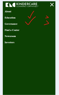
What could improve this:
Bringing key navigation actions closer to the thumb-friendly zone
Increasing tap-target sizes and Ensuring consistent button alignment and spacing
Visual indicators (arrows or chevrons) for expandable items
Consistent interaction patterns across all menu options
When navigation behaves predictably, users spend less time deciding and more time progressing.
Familiar Patterns and Interaction Feedback
Certain interactive elements—modals, cards, and overlays—don’t always follow patterns users expect from modern websites. For example:
Backgrounds don’t consistently dim behind modals
Clickable cards lack hover or active feedback
Close actions are small or placed in hard-to-reach corners

While these issues don’t prevent task completion, they subtly erode user confidence.
What could improve this:
Familiar modal behaviors (background dimming, tap-outside-to-close)
Hover and active states for interactive cards
Larger, more accessible close actions
Predictable interaction patterns reduce hesitation and make the experience feel effortless.
Small Inconsistencies That Add Friction
a. Button inconsistency
Across different pages, primary actions vary in size, style, and emphasis. While each button works in isolation, the lack of consistency makes it harder for users to quickly recognize the main action.
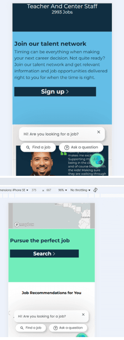
Improvement
Standardizing button hierarchy would make actions feel familiar and easier to scan.
b. Footer behavior
The footer is well organized, but sub-menus open in unexpected directions, breaking the sense of grouping users rely on at the bottom of a page.

Improvement:
Expanding sub-menus directly below their parent items would preserve visual grouping and reduce hesitation.
What Works Well
Despite these gaps, several aspects of the experience are strong:
Footer content is logically grouped and easy to scan
Information architecture is generally well structured
Visual hierarchy helps users orient themselves quickly
These foundations position the site well for refinement rather than a full redesign.
Final Thoughts
The KinderCare Learning Companies website successfully establishes trust through visual design—an essential requirement for childcare platforms. However, small interaction ambiguities and inconsistent patterns introduce unnecessary friction during exploration.
By refining interaction cues, improving navigation predictability, and optimizing mobile ergonomics, the experience can better support parents during moments that matter.
Good design isn’t just about visual polish—it’s about reducing uncertainty and helping users move forward with confidence at every step.