Designing a confident fiber internet buying experience - Enterprise UX Case Study
Date
2023
Service
E-commerce
Client
Lumen Technologies

Project Overview
Internet isn’t a luxury — it’s how people work, stream, and stay connected every day.
Many Quantum Fiber customers were still on DSL when Fiber became available. At a glance, upgrading felt like an obvious improvement: faster speeds, better reliability, and a future-ready internet.
My work focused on improving the self-serve upgrade experience for existing DSL customers moving to Fiber.
My Role:
This was not a visual redesign. I worked within real system and business constraints to reduce uncertainty in the DSL-to-Fiber upgrade journey.
I focused on clarifying eligibility, guiding key decisions, and sequencing information so customers felt confident before checkout — partnering closely with Product, Engineering, and Design to ensure solutions scaled without increasing support dependency.


The Problem
Upgrading from DSL to Fiber should have felt like a clear -yes.
Instead, customers struggled to make a confident decision because they lacked clarity at the moment of commitment.
The problem wasn’t speed or price. It was confidence.
The Solution:
The solution turned a technical upgrade into a guided decision. Instead of asking users to interpret system details, the flow was redesigned to answer questions before uncertainty could set in.
Key shifts:
eligibility confirmed early
clear guidance at each step
installation expectations set upfront
unnecessary technical detail removed
The result was a calm, confidence-driven upgrade experience — without reliance on customer support.
Where Confidence Broke Down in the Journey:
Confidence didn’t break all at once.
It broke at key moments in the upgrade journey.
Customers weren’t sure:
If Fiber was available for their exact unit
What would happen after choosing a plan
What installation would actually involve
The legacy DSL experience surfaced technical information, but didn’t explain what it meant or what would happen next.
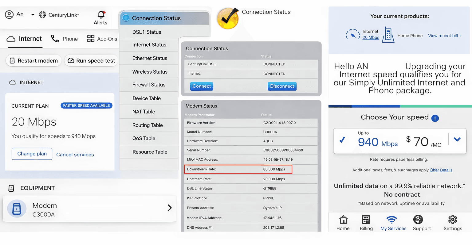
At these moments, users paused, re-read screens, or dropped off — choosing to delay the upgrade rather than risk making the wrong choice.
User Research:
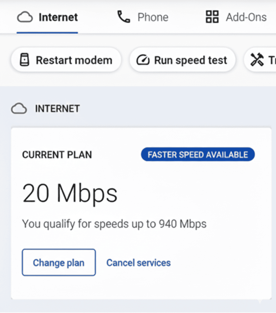
When users entered the upgrade flow, they weren’t comparing plans.
They were trying to answer one question:
“Can I trust what will happen next?”
Research and support data showed that users moved cautiously — looking for reassurance before committing.
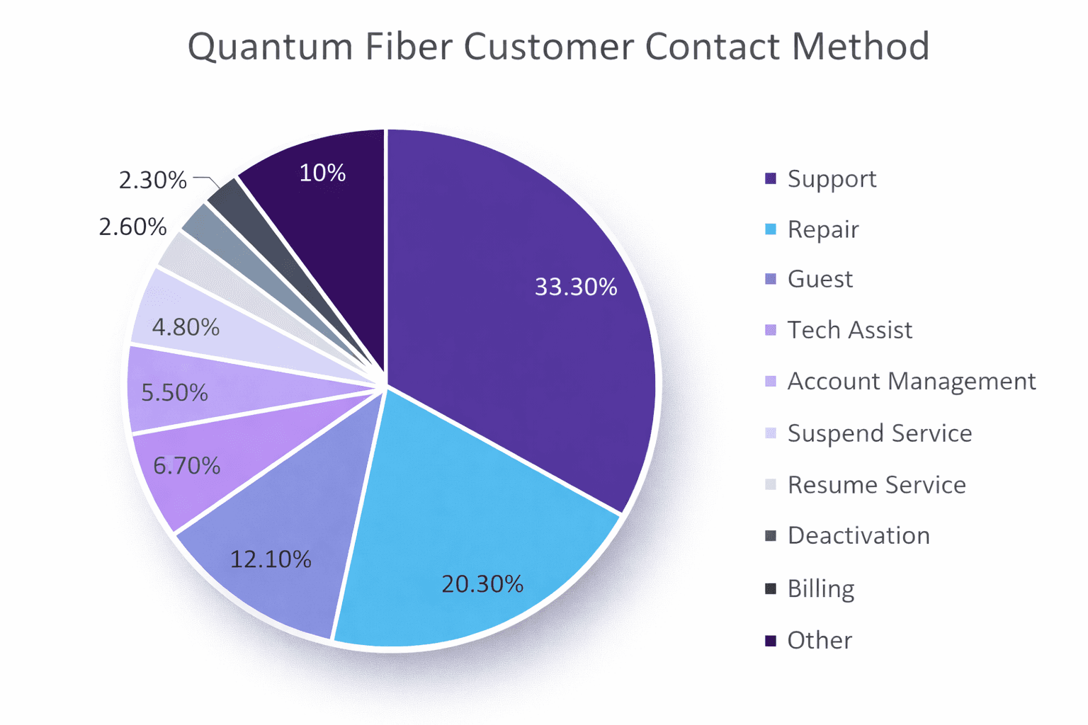
Many support contacts weren’t about fixing issues. They were about confirming availability, timing, and next steps.
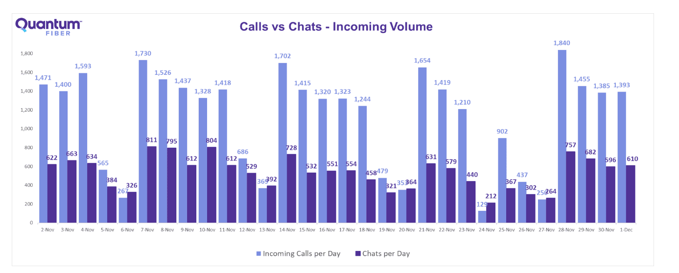
The insight was clear: uncertainty came from missing clarity at critical moments — not from product complexity.
Two primary user types emerged — both motivated to upgrade, but blocked by uncertainty at different moments.
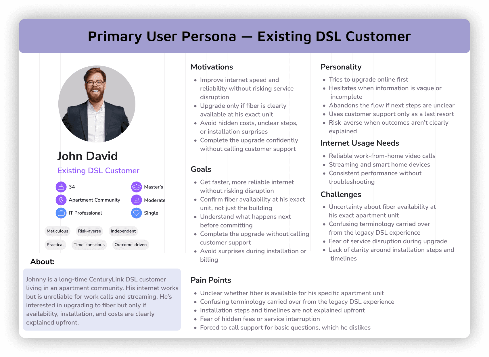
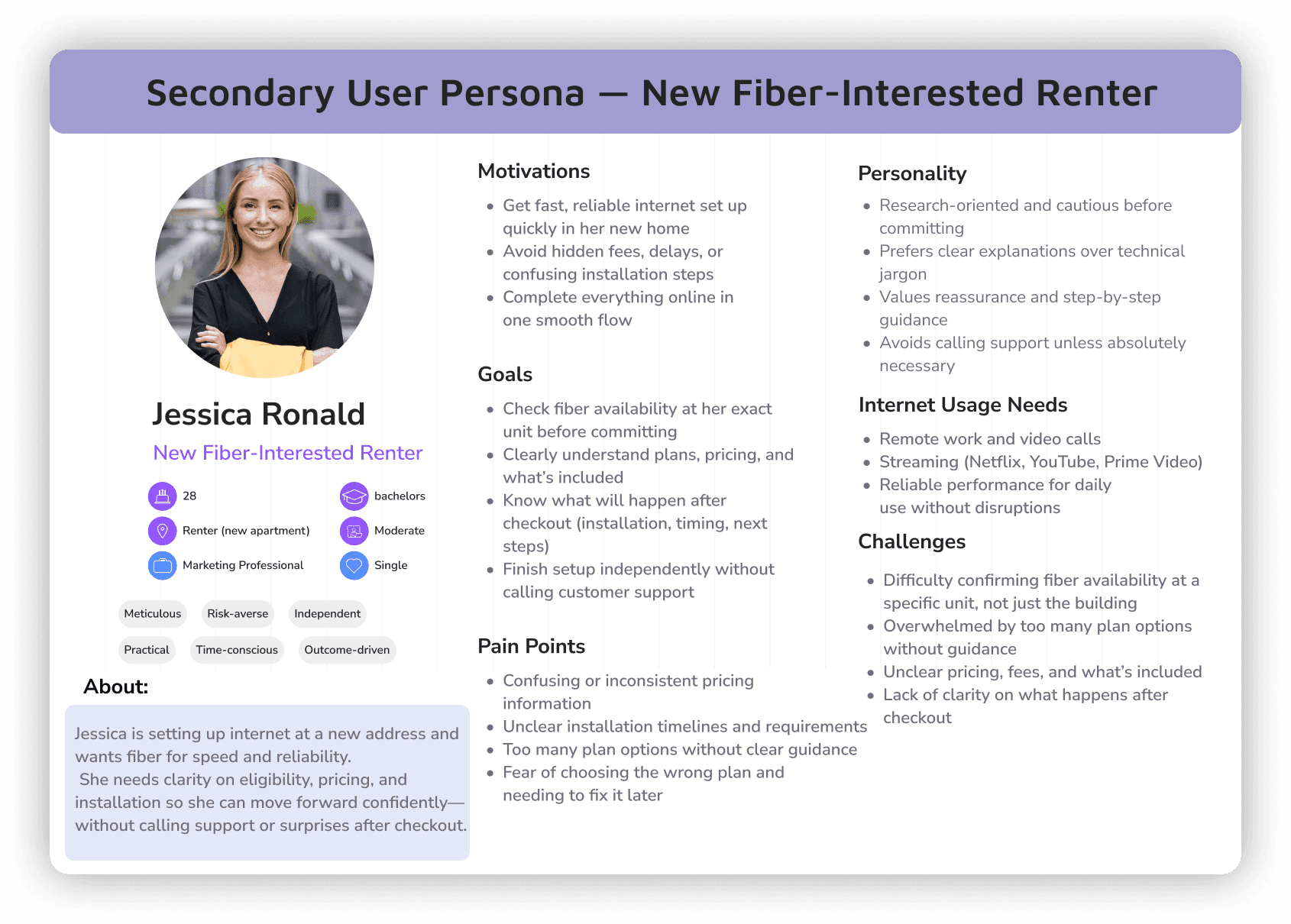
Both personas were risk-averse and needed clarity on eligibility, installation, and next steps before committing.
User Flow (Existing → Improved):
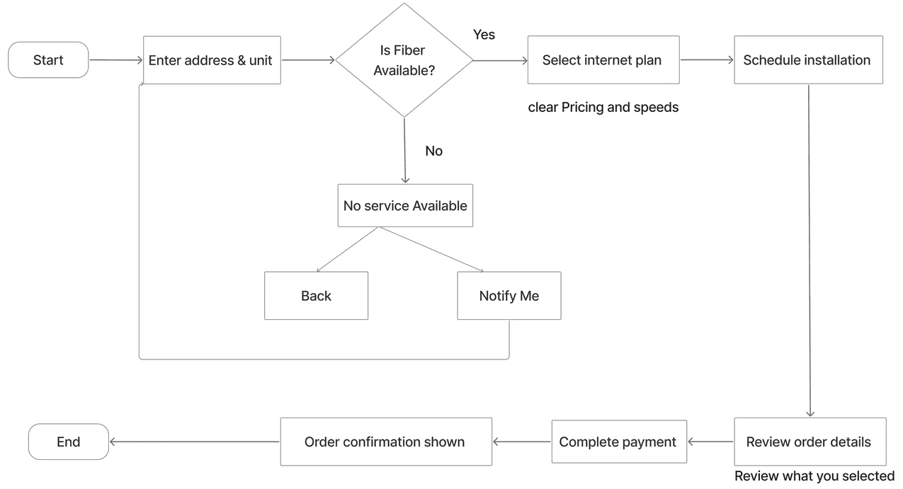
I mapped the upgrade journey to identify where confidence dropped and where guidance was missing.
How I Approached the problem:
Users didn’t need more information. They needed clear guidance at the right moment.
I focused on identifying where confidence dropped in the upgrade journey — especially during eligibility checks, plan selection, and installation steps.
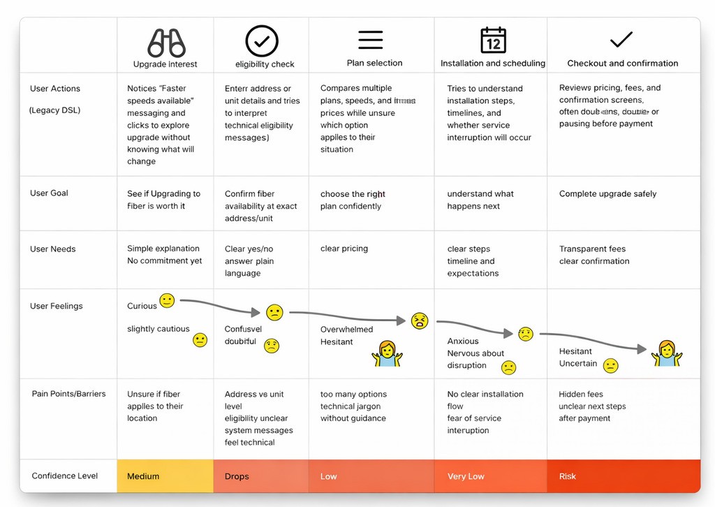
Mapping the upgrade journey revealed where users hesitated — not because of options, but because next steps were unclear. Rather than explaining everything upfront, I:
clarified what mattered at each step
removed technical language that didn’t aid decisions
set expectations before users had to ask
Every design decision answered one question:
“What happens next — and should I feel confident moving forward?”
By restructuring the flow around that question, the upgrade experience shifted from a technical process to a guided path — helping users move forward with confidence, without relying on support.
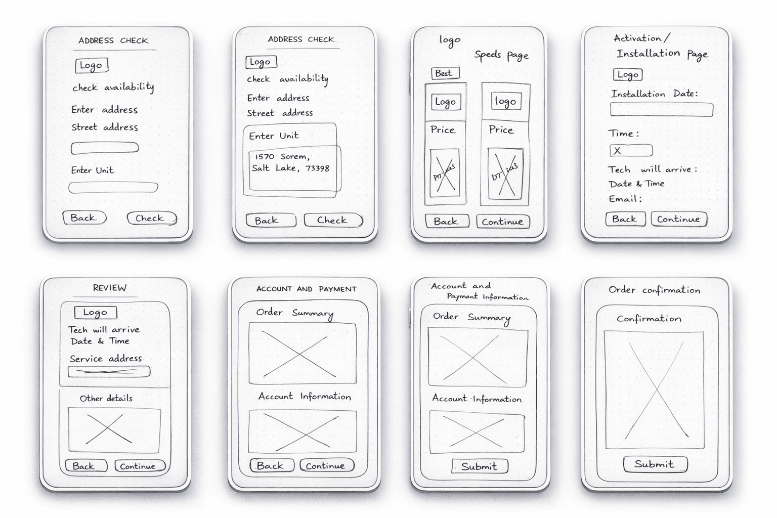
Low-Fidelity Exploration:
I used low-fidelity wireframes to test clarity — not visuals.
The focus was on:
what users needed to know at each step
how the journey progressed
when expectations had to be set
These explorations ensured the flow felt predictable before moving into final design.
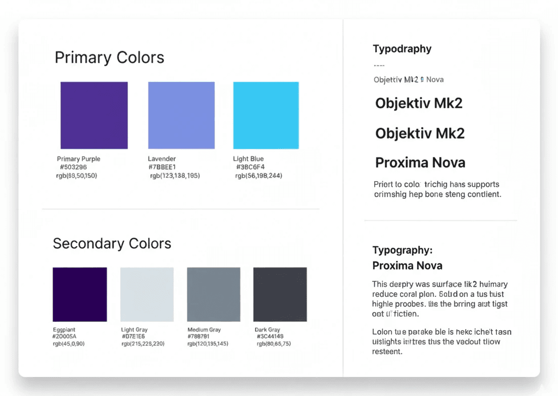
Color theory and Typography:
Final Screens & End-to-End Flow:
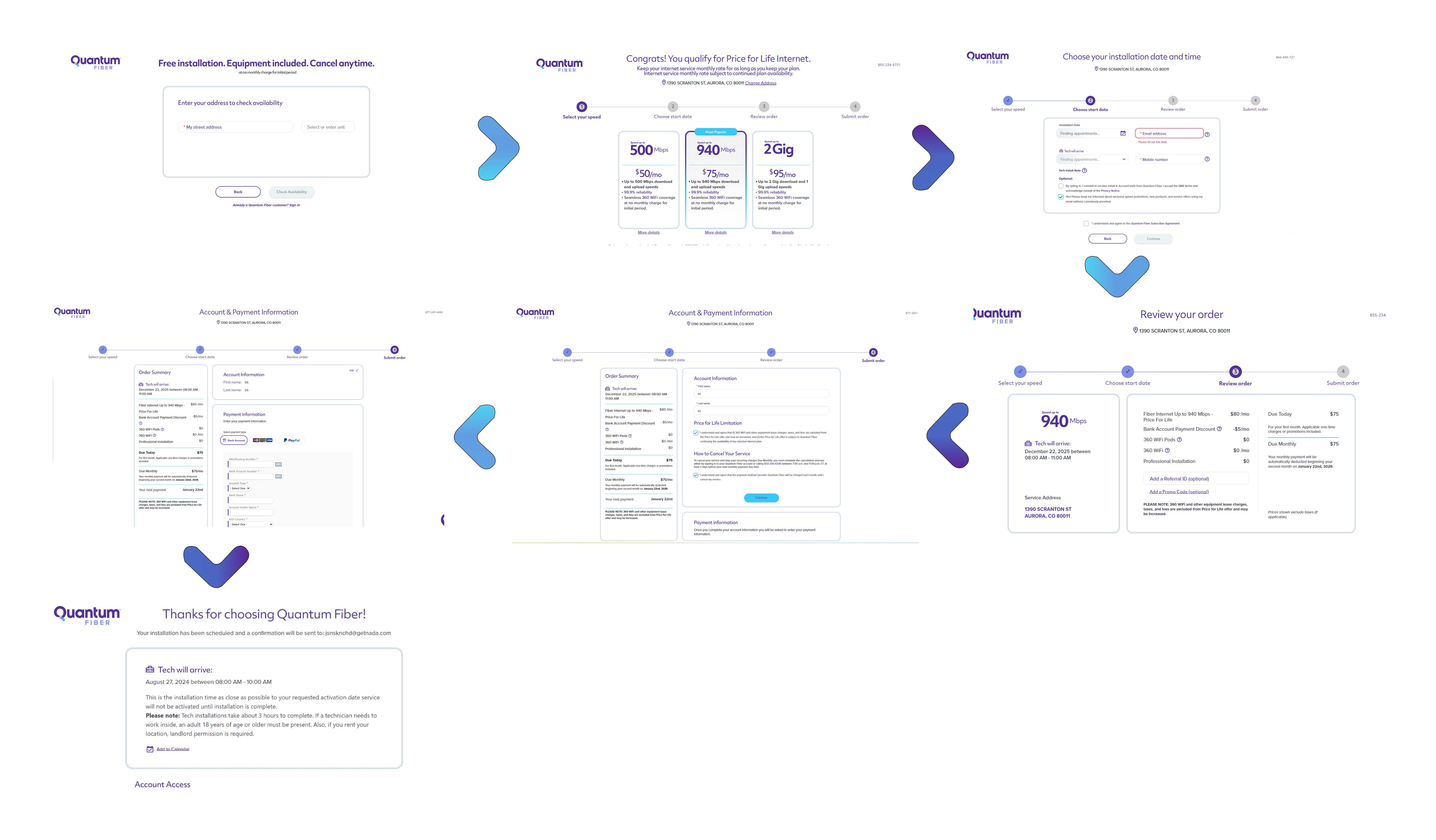
A high-level view of the complete Quantum Fiber upgrade journey—from checking availability to order confirmation—designed with clear progression and predictable steps.
A short walkthrough demonstrating how users move through each step, with clear inputs, validations, and next actions across the flow.
Outcome & Impact:
The redesigned flow helped turn a hesitant upgrade into a clear and confident decision.
Customer: Users felt confident completing the upgrade without stopping to second-guess their choices.
Experience: The journey shifted from a technical process to a guided, predictable flow where users always knew what would happen next.
Business: More DSL → Fiber upgrades were completed through self-service, with fewer support calls related to eligibility and installation clarity.
The result was a smoother upgrade experience that reduced friction, built trust, and scaled without increasing operational effort.
Learnings & Reflection:
This project reinforced that clarity builds confidence.
Users weren’t blocked by price or speed — they were blocked by uncertainty.
Showing the right information at the right moment proved more effective than explaining everything upfront.
Designing within legacy systems also highlighted that good enterprise UX isn’t about removing complexity — it’s about structuring it thoughtfully.